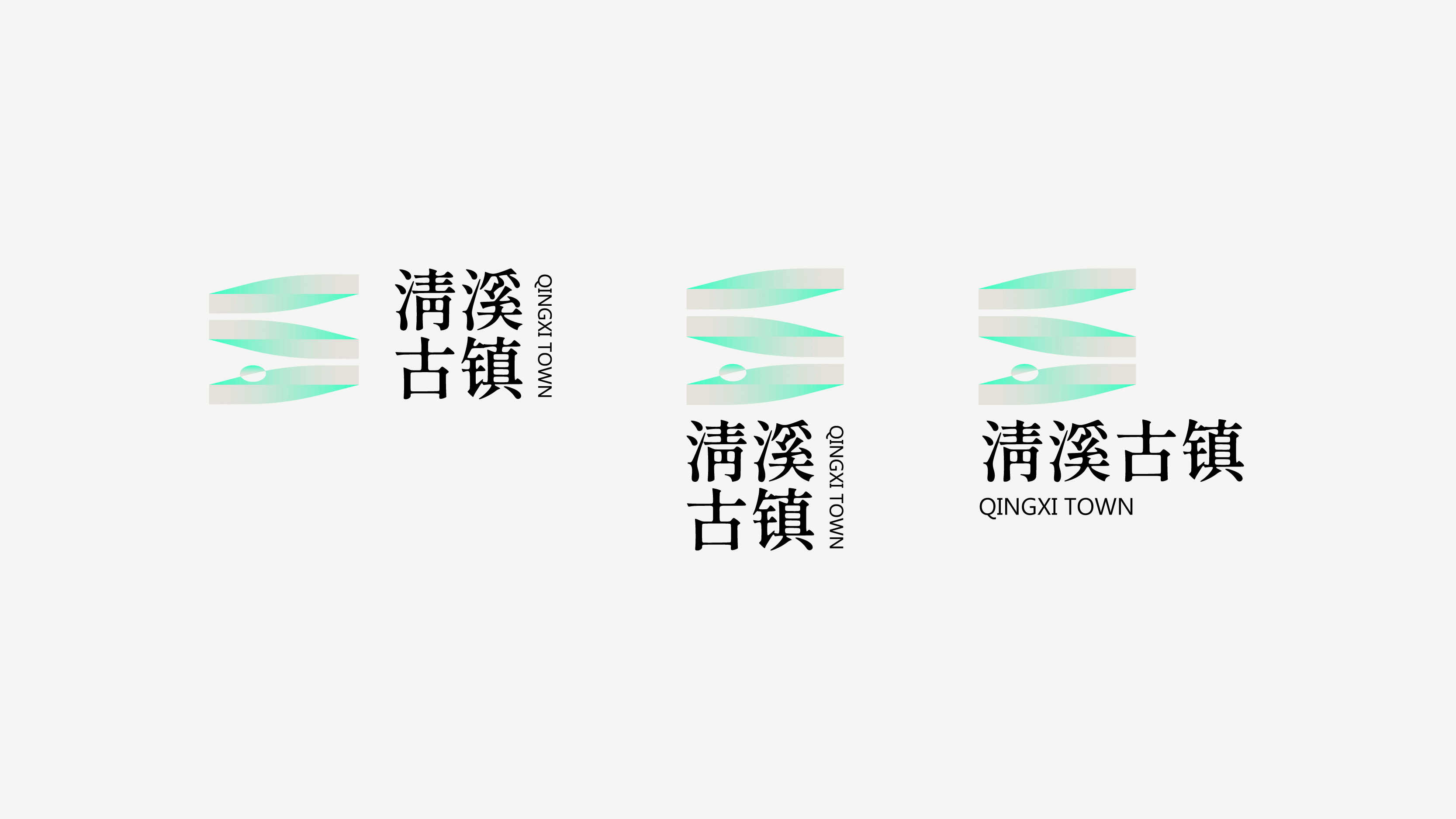
QINGXI TOWN BRAND DESIGN
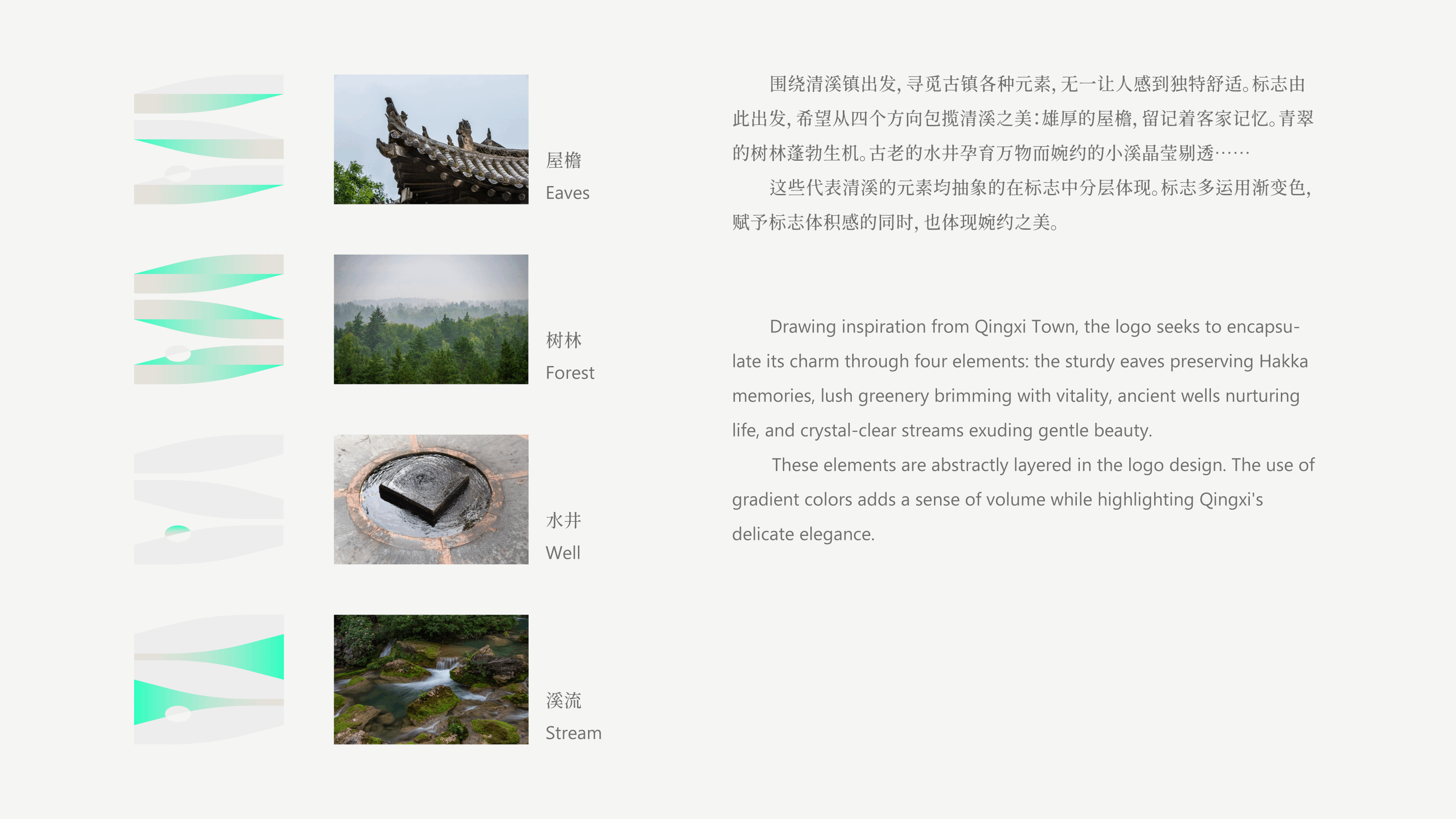
The design revolves around Qingxi Town, capturing its unique and comforting elements and integrating them into the logo. The logo in terprets the beauty of Qingxi from four perspectives: the majestic eaves that preserve Hakka cultural memories, the lush forests that symbolize vibrant life, the ancient wells that nurture all living things, and the crys tal-clear streams that exude elegance and natural brilliance.
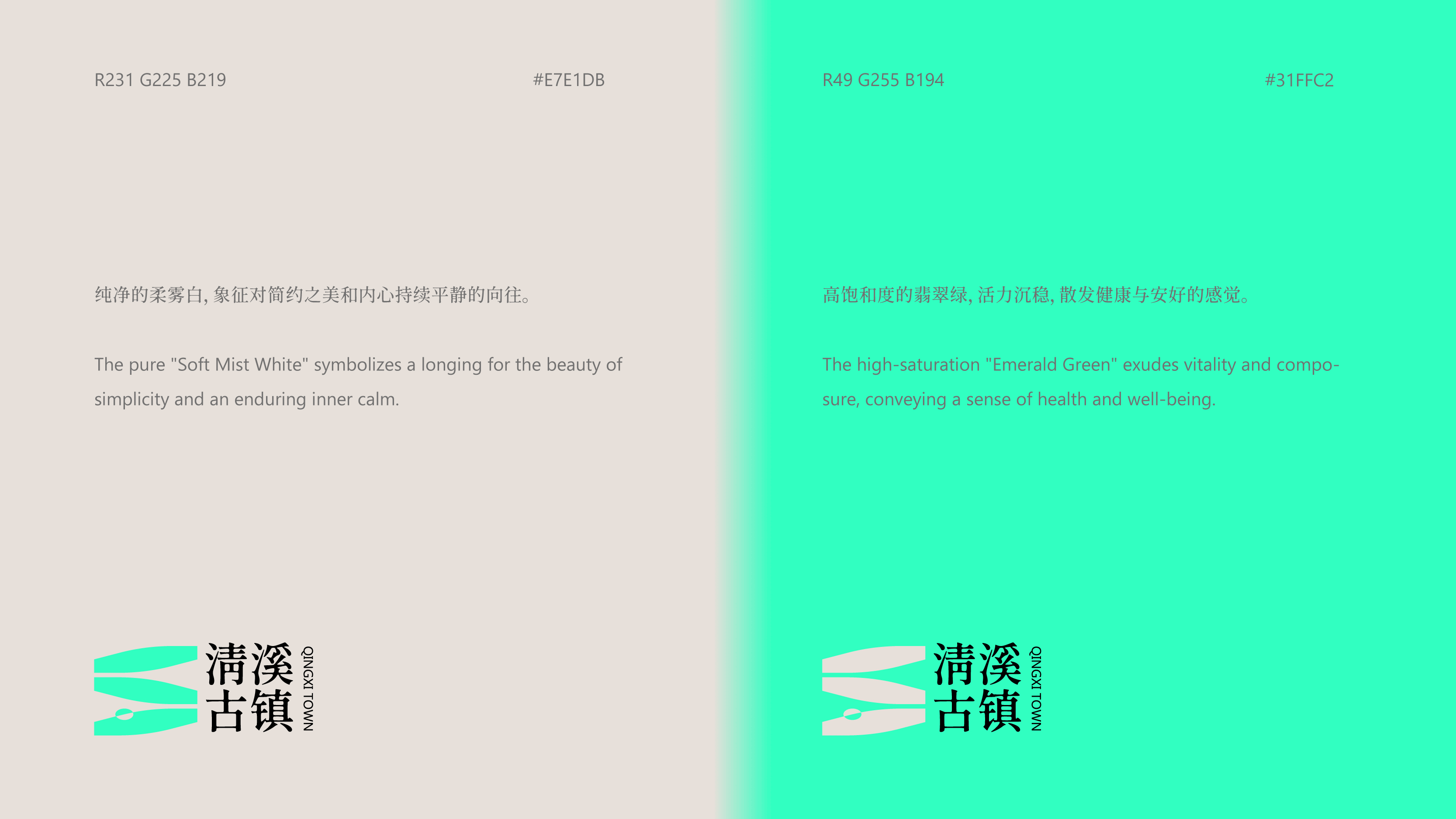
These iconic elements of Qingxi are abstractly layered in the logo de sign. The logo primarily employs gradient colors, giving it a sense of depth and a soft aesthetic. The theme colors are a combination of a steady misty white and a vibrant high-saturation emerald green, reflecting both Qingxi's beauty and its dynamic vitality, perfectly aligning with the spirit and character of the ancient town.
清溪古镇品牌设计
围绕清溪镇展开设计,捕捉古镇独特而舒适的元素,将其融入标志之中。标 志从四个方向诠释清溪之美:雄伟的屋檐承载客家文化记忆,郁郁葱葱的树 林展现生命的蓬勃,古老的水井象征万物滋养,而清澈的小溪则流露婉约晶 莹的自然之美。
这些清溪的代表性元素以抽象形式分层体现于标志设计中。标志以渐变色 为主,赋予其立体感与柔美气质。主题色搭配沉稳柔雾白与充满活力的高饱 和翡翠绿,既体现了清溪的内敛之美,又传递出其勃勃生机与活力,完美契 合古镇的气质与精神内核。